The one-day redesign
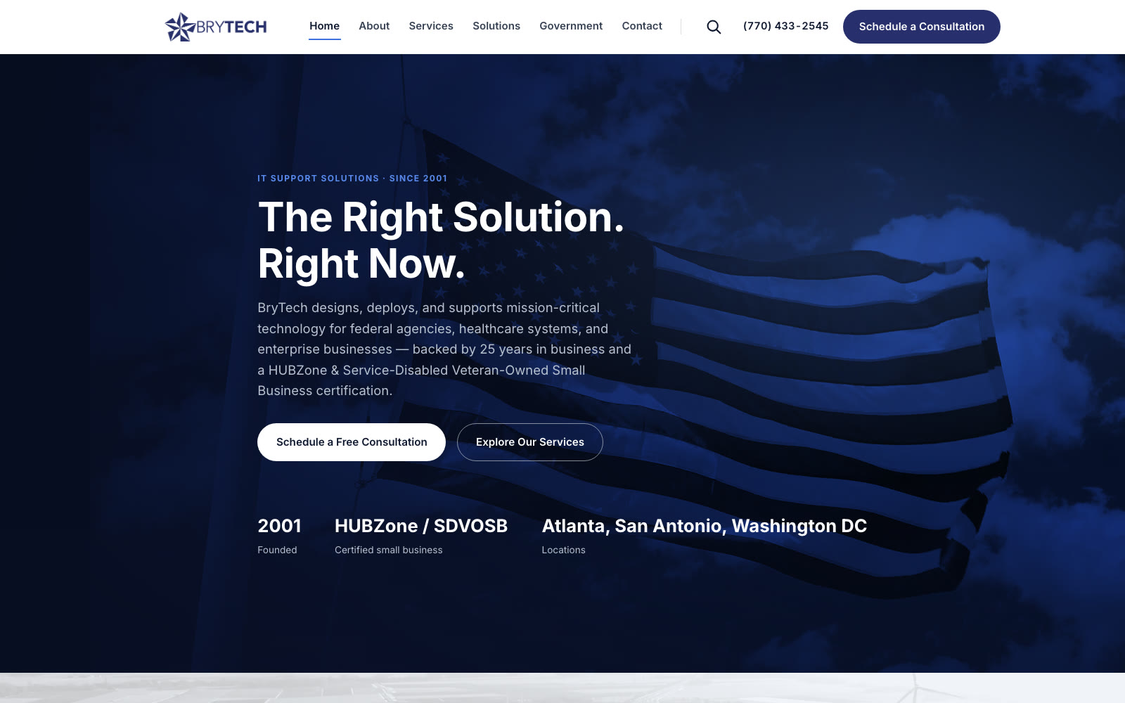
A litmus test with a single rule about time: take a real company's public website and carry it through planning, design, build, revision, testing and deployment — all of it, to a deployable result — inside one day.
The subject was BryTech, Inc., a HUBZone and Service-Disabled Veteran-Owned IT services company in Chamblee, Georgia. I have never spoken to anyone there. There was no kickoff, no brief, no discovery interviews, no stakeholder review, and no access to anything that isn't public. Everything below was drawn from their live site, their published capabilities statement, and their sitemap — the same material any visitor can reach.
The question the exercise asks is narrow and worth asking honestly: with modern tooling, how much of an agency engagement's output can one person actually produce between morning and night — and where does the quality break?
The constraints
What was allowed
- Their live site, their PDF capabilities statement, their sitemap — public material only
- Stock footage already licensed to the company's asset folder
- Their own copy, carried across verbatim wherever it still held up
- One person, start to finish, with AI as the engineering pair
What was not
- No conversation with anyone at the company — no brief, no review, no approvals
- No invented facts: every figure traced to something they had already published
- No page templates or theme purchases — hand-written HTML and CSS
- No sliding the deadline. Whatever the day produced was the deliverable
The day
What came out of it

| What existed | What the day produced |
|---|---|
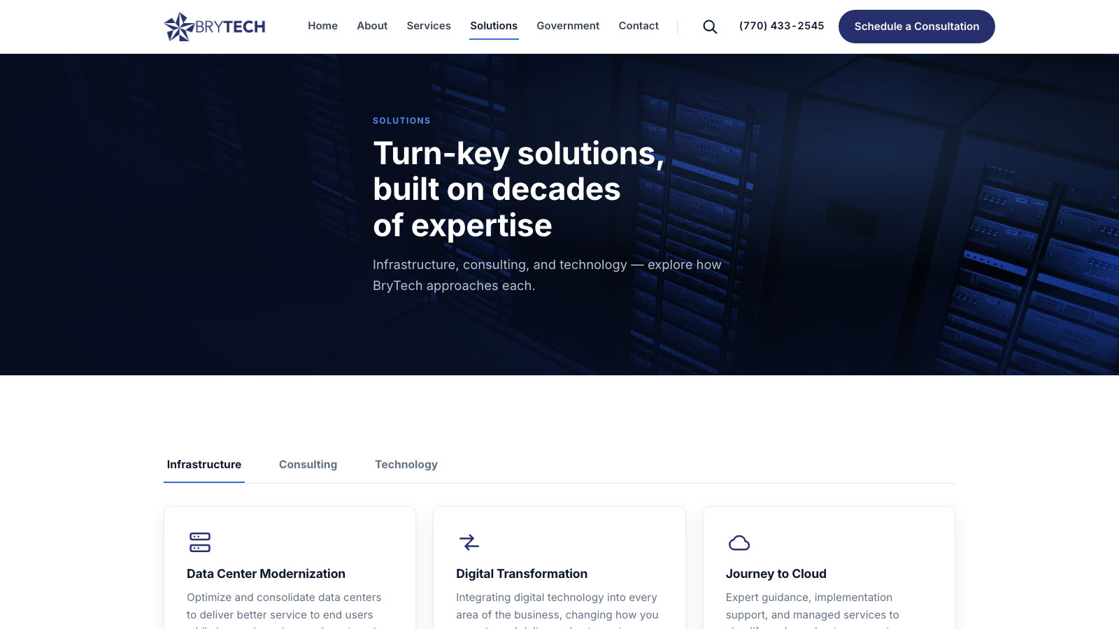
| A Government page that was blank on the live site | A full page consolidating credentials, financing, past performance and the fact sheet, with a sticky section nav |
| Two orphaned pages — Financial Flexibility, Fact Sheet — reachable only by repeated navigation | Folded into one page with anchored sections and a redirect plan for the old URLs |
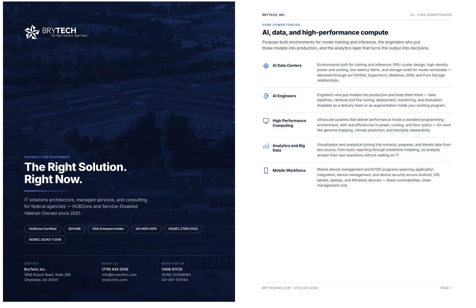
| A 9-page, 10 MB capabilities statement with the registration codes buried on page three | 14 pages, 1.5 MB, codes on page one, generated from HTML so it can be re-run |
| Past performance — three federal contracts — published only inside the PDF | Surfaced on the site as the strongest evidence on the page |
| Vendor and agency logos scattered as text pills | Two logo tickers, one stepped and one continuous, built from their own asset library |
What the exercise actually proved
That the production half — layout, typography, build, compression, testing — compresses almost completely. A day is enough to take six pages from nothing to deployable, and enough to rebuild a print document alongside them.
That the other half does not compress at all. Working only from public material, I could see that their DUNS number should now be a UEI, that "Schedule 70" has not existed since GSA consolidated its schedules, that their own PDF claimed both "20 years" and "24 years" on facing pages, and that a phone number printed as 279-BRYTECH cannot be dialled. What I could not do is decide any of it. Every one of those is a question for someone at the company, and no amount of tooling produces the answer.
So the honest reading is this: a day buys a finished artifact and a very good set of questions. It does not buy the answers, and a redesign that pretends otherwise is guessing.